On July 28, 2020, The American Prospect published Les Leopold’s analysis of Covid-19 deaths in New York City during the first month’s of the pandemic. You can read the story by clicking here.
This page is the repository for data supporting Les’s research into Covid deaths.
You may download the spreadsheet with the NYC Department of Health Covid-19 statistics and US Census information that Les used to do his analysis by clicking here.
Here are the Technical Notes that go with the story.
The New York City Department of Health tracks the number of deaths (and cases) by zip codes (more than 170 of them.) Zip Codes in New York can be fairly broad groupings of neighborhoods that may vary widely demographically, which is to be expected since the zip codes are intended to assist in mail delivery, not social analysis. For our study we needed to use these data to find out more about who is likely to die based on an array of demographic information.
Our solution was to look at the 2,047 census tracts in New York City, which more closely correspond to actual neighborhoods. These tracts are surveyed by the U.S. Census each year for their defining social characteristics, which number in the hundreds of categories, including income, ethnic identity, age and race. New York City does not provide COVID-19 death rate data for these smaller tracts, but we applied the death rate for each zip code to each of the census tracts within that zip code.
This is not perfect. In a zip code with tracts that vary considerably by income, race and ethnicity, the same zip code death rate would apply to all the tracts. However, in most zip codes there is a preponderance of one kind of neighborhood, be it richer or poorer, lighter or darker. So by including more than two thousand neighborhoods, it is likely that the vast majority will be assigned a zip code death rate that reasonably reflects the characteristics of that neighborhood. And most importantly, we gain the benefit of analyzing the detailed demographic data of each neighborhood provided by the U.S. Census.
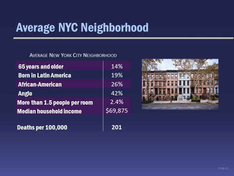
To see how this works, let’s start with a New York City neighborhood that is the average of all the census tracts. It has the characteristics listed below:
Now imagine that you have moved from this average neighborhood to another that is exactly the same in terms of income, race/ethnicity, crowded housing and income, except for the fact that there are about one-third more people over 65 years old. How many more deaths would there be in the neighborhood with a higher percentage of older people? That’s the sort of question that multiple regression can help us answer.
Or imagine that you moved from the average neighborhood, the one pictured above, to another that is exactly the same, except that there are about one-third more people born in Latin America or one-third more African-Americans. How would the death rate change there?
Multiple regression allows us to do this for each variable, and gives us back actual death-rate estimates that help us compare the impacts of the different causes.
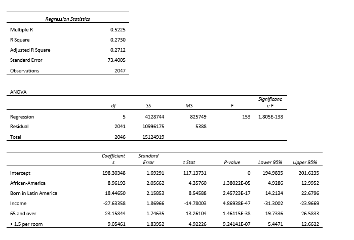
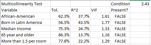
The regression results shown in the chart above are highly significant, statistically. The independent variables have been standardized, so that we can ask, “How much does the death rate vary with a change of one standard deviation of each of the independent variables?” Taken together, these five variables explain about 27 percent of the variation in death rates among the zip codes. By doing another statistical test, we also know that each variable is significantly independent from all the others –that each one is measuring something different. (Multicollinearity VIF scores are 1.61, 1.77, 1.33, 1.16, and 1.29.)
Our underlying spreadsheet data and regression summary can be found by clicking here.
The final regression looked like this:
The Multicollinearity Test looks like this:
Please send any questions or comments to Les Leopold info@runawayinequality.org.